Wednesday 28 September 2011

The Frame


Here is another piece of work that certainly exhibits the use of COLORS. Kahlo utilizes color to surround the main subject, which draws the viewer to the center of the piece. Yet again, orange and red appears as the dominant colors within the frame. In addition to the warm colors Kahlo uses, blue is expressed within a couple of her works as well. Perhaps, the use of blue is to contrast the orange and red colors.

Wednesday 21 September 2011

Frida (2002)


In 2002, the film adaption of Frida Kahlo's life came out. It shows her journey as an artist and the moments in her life that shaped her unique style. The film shed light on the infamous relationship between Frida and Diego Rivera, her on and off husband. When watching the film and having done previous research on Frida, I felt the intense emotion being portrayed in this film. It was quite difficult to see her character, who is free spirited, endure such tragedies. All in all, I definitely suggest watching this film, as it gives an idea of what Frida's life was like. 

Works of Art

Elements & Principles of Design

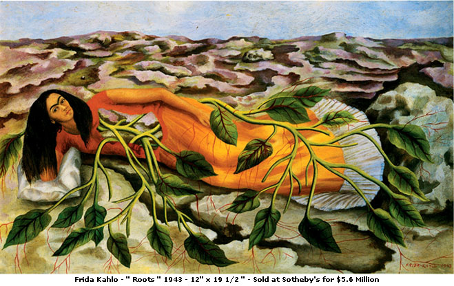
Throughout her works of art, COLOR is a dominant factor. Her Mexican heritage has certainly influenced many of her pieces. This can be seen through her clothing styles as well as through the reoccurrence of Orange/Red colors. Along with culture, red colors are used for illustrating blood or internal organs. Green is another color that is prominent throughout her works. Greenish tones are mainly utilized for the nature aspect of her pieces. Overall, the colors that Kahlo uses give off an earthy feel. 

Kahlo uses TEXTURE to create a contrast between the rough and soft spaces. The rough textures can generally be found in the background to illustrate the dry lands. The softer textures are found in main subjects, an example being, Kahlo's Mexican styled dresses. 

In her pieces, LINES can be found predominantly in the backgrounds. They usually are less defined but with the use of colors they are easier to spot. In my opinion, the lines are there for the purpose of creating a comparison within her pieces. 


With the use of COLOR, TEXTURE and LINES, these elements demonstrates variety within Kahlo's art. Each element gives way to the use of EMPHASIS and BALANCE. Vibrant colors directs the viewers eyes to the center point of her pieces. The lightness and darkness of the colors allows for a balance within the pieces as well. As mentioned earlier, texture creates a distinction between rough and soft. That distinction balances the two opposites. Similarly, the undefined lines expresses a balance. Particularly because the line separates pieces horizontally as well as vertically.

The Love Embrace of the Universe, The Earth (Mexico), Diego, Me, and Senor Xolotl. 1949
Los Dos Fridas. 1939
Tree of Hope. 1946

Tuesday 20 September 2011

Frida Kahlo


Frida Kahlo de Riveria
July 6, 1907 - July 13, 1954

Mexican/Spanish heritage

Suffered many injuries throughout her lifetime

Diego Rivera - Mexican painter  (muralist)

Surrealism

                                            Andre Breton
In the 20th century, Surrealism began as a literary movement founded by a French poet, Andre Breton. As well as being a poet, Andre Breton studied medicine and psychiatry. His background definitely influenced the meaning behind Surrealism as he was intrigued by Freud's views on the subconscious mind. Surrealism encourages the merging between the subconscious and conscious mind. The movement was constantly growing and had reached international audiences. It soon developed artistically as many artists had contributed greatly to this movement. Artists such as, Rene Magritte, Salvador Dali, Max Ernst and many others.